> ## 12-4 커피 전문점 접근성 분석하기
>
> # Step 1 : 데이터 준비하기
>
> setwd(dirname(rstudioapi::getSourceEditorContext()$path))
> load("./01_code/coffee/coffee_shop.rdata")
> head(coffee_shop)
Simple feature collection with 6 features and 7 fields
Geometry type: POINT
Dimension: XY
Bounding box: xmin: 126.9136 ymin: 37.44907 xmax: 127.0142 ymax: 37.58296
CRS: +proj=longlat +datum=WGS84 +no_defs
brand name juso x y station metro_idx
1 이디야커피 신길역점 서울특별시 영등포구 영등포로 353 126.9181 37.51512 신길 51.5
2 이디야커피 라이프점 서울특별시 영등포구 63로 40 126.9392 37.51954 여의나루 44.3
3 스타벅스 동숭로아트점 서울특별시 종로구 동숭길 110 127.0039 37.58296 혜화 69.3
4 스타벅스 남부터미널2점 서울특별시 서초구 효령로 274 127.0142 37.48439 남부터미널 64.0
5 이디야커피 시흥점 서울특별시 금천구 금하로 750 126.9136 37.44907 신림 45.0
6 투썸플레이스 서울타워점 서울특별시 용산구 남산공원길 105 126.9879 37.55111 명동 59.4
geometry
1 POINT (126.9181 37.51512)
2 POINT (126.9392 37.51954)
3 POINT (127.0039 37.58296)
4 POINT (127.0142 37.48439)
5 POINT (126.9136 37.44907)
6 POINT (126.9879 37.55111)
>
> # Step 2 : 사용자 화면 구현하기
>
> library(shiny)
> library(leaflet)
> library(leaflet.extras)
> library(dplyr)
>
> ui <- bootstrapPage(
+ #---# 사용자 화면 페이지 스타일 설정
+ tags$style(type = "text/css", "html, body {width:100%;height:100%}"),
+ #---# 지도 생성
+ leafletOutput("map", width = "100%", height = "100%"),
+ #---# 메뉴 패널
+ absolutePanel(top = 10, right = 10,
+ selectInput(
+ inputId = "sel_brand",
+ label = tags$span(style="color:black;", "프랜차이즈를 선택하시오"),
+ choices = unique(coffee_shop$brand),
+ selected = unique(coffee_shop$brand)[2]
+ ),
+ sliderInput(
+ inputId = "range",
+ label = tags$span(style="color:black;", "접근성 범위를 선택하시오"),
+ min = 0, max = 100, value = c(60, 80), step = 10
+ ),
+ plotOutput("density", height = 230)
+ )
+ )
>
> # Step 3 : 서버 구현하기
>
> server <- function(input, output, session) {
+ #---# 반응식 1 : 브랜드 선택 + 접근성 범위
+ brand_sel <- reactive({
+ brand_sel <- subset(coffee_shop,
+ brand == input$sel_brand &
+ metro_idx >= input$range[1] & metro_idx <= input$range[2]
+ )
+ })
+ #---# 반응식 2 : 브랜드 선택
+ plot_sel <- reactive({
+ plot_sel <- subset(coffee_shop,
+ brand == input$sel_brand
+ )
+ })
+ #---# 밀도 함수 출력
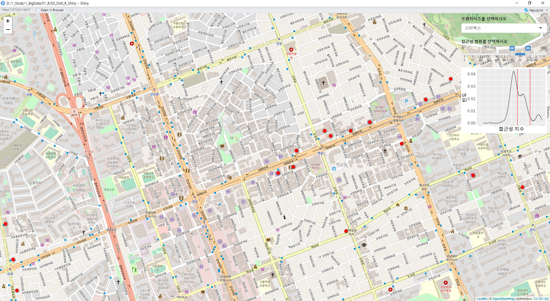
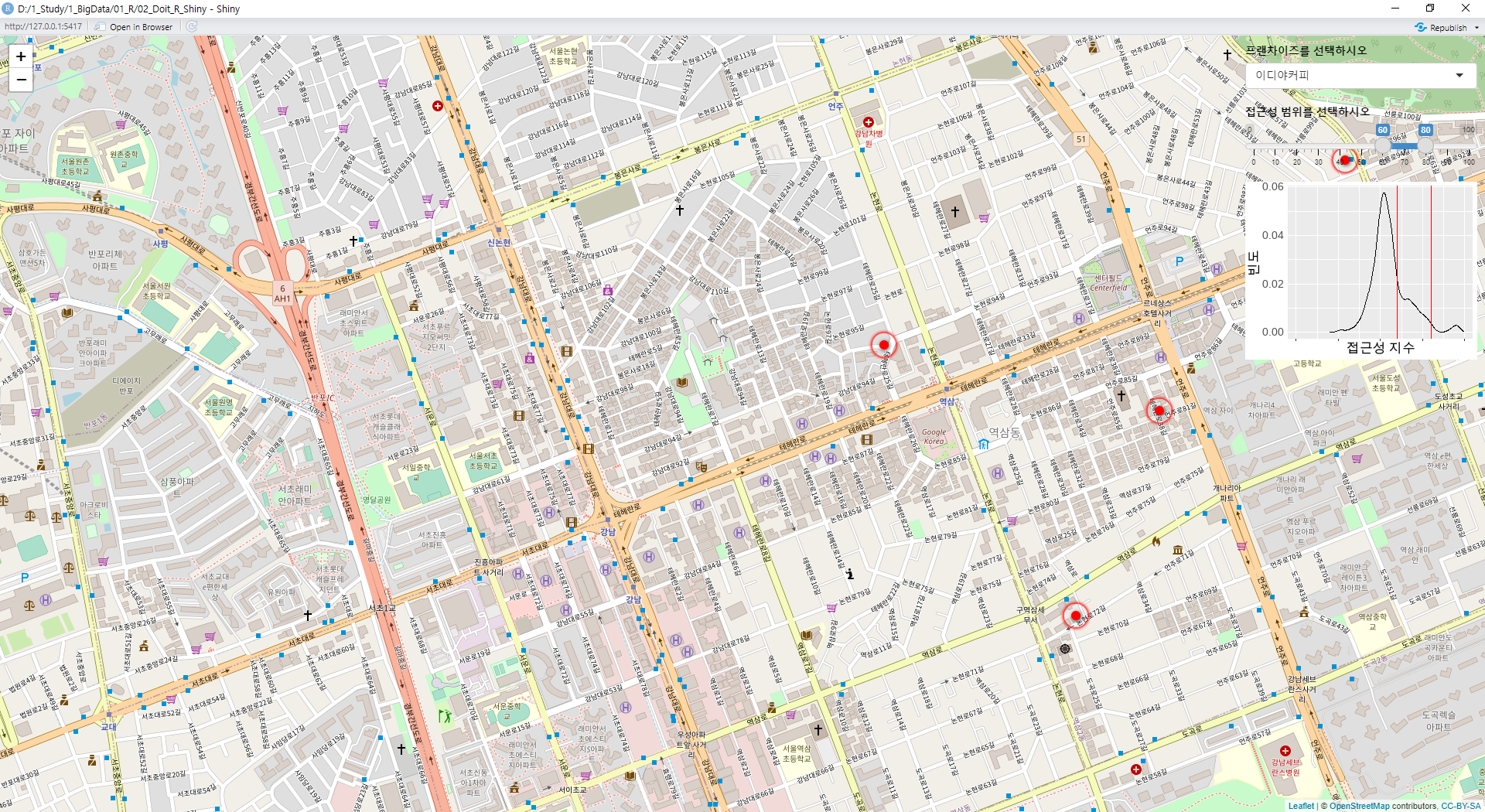
+ output$density <- renderPlot({
+ ggplot(data = with(density(plot_sel()$metro_idx), data.frame(x, y)),
+ mapping = aes(x = x, y = y)) +
+ geom_line() +
+ xlim(0, 100) +
+ xlab("접근성 지수") + ylab("빈도") +
+ geom_vline(xintercept = input$range[1], color = "red", size = 0.5) +
+ geom_vline(xintercept = input$range[2], color = "red", size = 0.5) +
+ theme(axis.text.x = element_blank(), axis.ticks.y = element_blank())
+ })
+ #---# 지도 출력
+ output$map <- renderLeaflet({
+ leaflet(brand_sel(), width = "100%", height = "100%") %>%
+ addTiles() %>%
+ setView(lng = 127.0381, lat = 37.59512, zoom = 11) %>%
+ addPulseMarkers(lng = ~x, lat = ~y,
+ label = ~name,
+ icon = makePulseIcon())
+ })
+ }
>
> # Step 4 : 애플리케이션 실행하기
>
> shinyApp(ui = ui, server = server)
Listening on http://127.0.0.1:5417
출처 : 김철민, ⌜공공데이터로 배우는 R 데이터분석 with 샤이니⌟, 이지스퍼블리싱, 2022
'데이터분석 > R' 카테고리의 다른 글
| [R 데이터분석 with 샤이니] 교통 카드 데이터 분석 사례 02 - 기초 분석 (0) | 2022.07.30 |
|---|---|
| [R 데이터분석 with 샤이니] 교통 카드 데이터 분석 사례 01 - 데이터 전처리 (0) | 2022.07.30 |
| [R 데이터분석 with 샤이니] 지진 발생 분석 (Shiny) (0) | 2022.07.26 |
| [R 데이터분석 with 샤이니] 여러 지역 아파트가격 상관관계 비교 (Shiny) (0) | 2022.07.26 |
| [R 데이터분석 with 샤이니] 아파트가격 상관관계 분석 (Shiny) (0) | 2022.07.26 |


